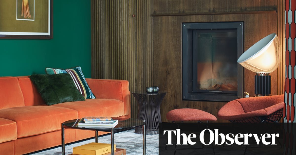
There was one thing design consultant Andreas Bloy was certain about when he started the renovation of his one-bedroom flat four years ago: there would be no white walls. Or white ceilings, come to that. “I couldn’t live with those,” he says, with a slight grimace. “I am a colourful person. Using colour in different ways is what brings me joy.”
True to his word, Andreas’s home, located in Oldenburg, in northwest Germany, where he lives with his two dogs, Paula and Emma, is devoid of any offending neutral surfaces. Instead, he has gone for an altogether more moody affair, largely with deep greens mixed with accents of tangerine and rust. “I have loved the combination of green and orange since I was a child and also dark colours, because they feel cosy and have more impact.”
After years of renting in Hamburg, Andreas saw the purchase of the raised ground-floor flat, originally with two bedrooms, as a long-awaited opportunity
Andreas found the flat in 2020 while visiting friends who lived in the same building, which originates from the early 1900s. The previous owners only used it occasionally and were eventually persuaded to sell. “There are two houses next to each other, one from 1907 and the other from 1905,” he says. “Both have four apartments each and we all share a single big garden. So it’s like a little community, which also attracted me.”
What was less attractive was his new home’s decor. While spacious and light, the apartment was stuck in a 1990s timewarp, with an era-typical palette of white, grey and black. It was instantly obvious a complete refurbishment was required to achieve the warm minimalist look Andreas hankered after.
The flat “needed everything – new floors, doors, windows, kitchen and bathroom,” he recalls. “There was a lot to do, but fortunately I managed to get a good team together to help.”
The starting point was pinning down the colours. Andreas was keen for each room to be painted a different shade of green to define each space and add depth to the scheme, so he commissioned custom-made paint from the German brand Caparol.
The walls of the open-plan living room, kitchen and dining room were given a rich emerald hue. ne wall was clad in floor-to-ceiling oak to house a fireplace, flanked on either side by bookshelves, hidden behind wooden slatted fronts. “I am very keen on natural materials and I particularly like oak,” he says. The flooring is a smoked oak herringbone for a visual contrast.
The kitchen, handmade by a local tradesman, features pistachio-coloured cabinetry that allows for integrated appliances and leaves very little on show – it’s a no-kitchen kitchen. The fluted island is a striking addition but just as importantly has hidden drawers to conceal utensils.
“I love to cook and entertain friends, but I didn’t want the kitchen to look like a typical one,” he explains. “I wanted the pieces in the kitchen to look more like furniture, because the living, eating and cooking areas are in one room, it was important I didn’t create three separate rooms. I wanted each space to have a connection with the others.” Even in the entrance hallway, a smart-looking oak cabinet turns out to be a home bar, to serve drinks to guests before they make their way into the living space.
In his continued quest for a clean, uncluttered look, Andreas turned the second bedroom into a dressing room, with slatted wooden wardrobe fronts echoing the wall in the living room
. “I don’t like having clothes in my bedroom, because it doesn’t feel relaxing,” says Andreas. “I like my bedroom to feel more like a hotel room and everything else hidden away in a separate room.”
In the petrol-green bedroom, the navy velvet bed with its curved headboard by Luiz was chosen because of its cocooning feel. “It is very cosy. When you go to bed, it’s like its arms are wide open to hug you,” Andreas says.
Furniture is skewed towards midcentury classic. In the living room, alongside the orange sofa by Piero Lissoni for Knoll, sits a high-backed Bertoia chair and a Platner table designed in 1966. Meanwhile, a green leather Barcelona chair sits in the entrance hall and a Saarinen table and set of Tulip chairs make up the dining area, which opens on to the balcony. “I love the table because the shape doesn’t obstruct the view of the garden.”
While the dining table and chairs came with him, many of the other pieces were bought for the flat. “All the things I had before in Hamburg were at least 20 years old and it was the right time to create a new home,” says Andreas.
The bathroom presents another shade of green. This time it’s soft with grey undertones and is given a utilitarian treatment with open metal shelving and a freestanding industrial-style sink from Ceramica Cielo.
For Andreas, his home has become the perfect antidote to his busy career. “I wanted it to be a place that suited me and where I can feel calm and have colours that I connect with,” he says. “I have that now. Every time I walk into the apartment, I feel like it gives me a warm welcome.”
